
A splash of
fresh fragrance glass.
Splash
Product Design / Package Design
Design Competition
2011
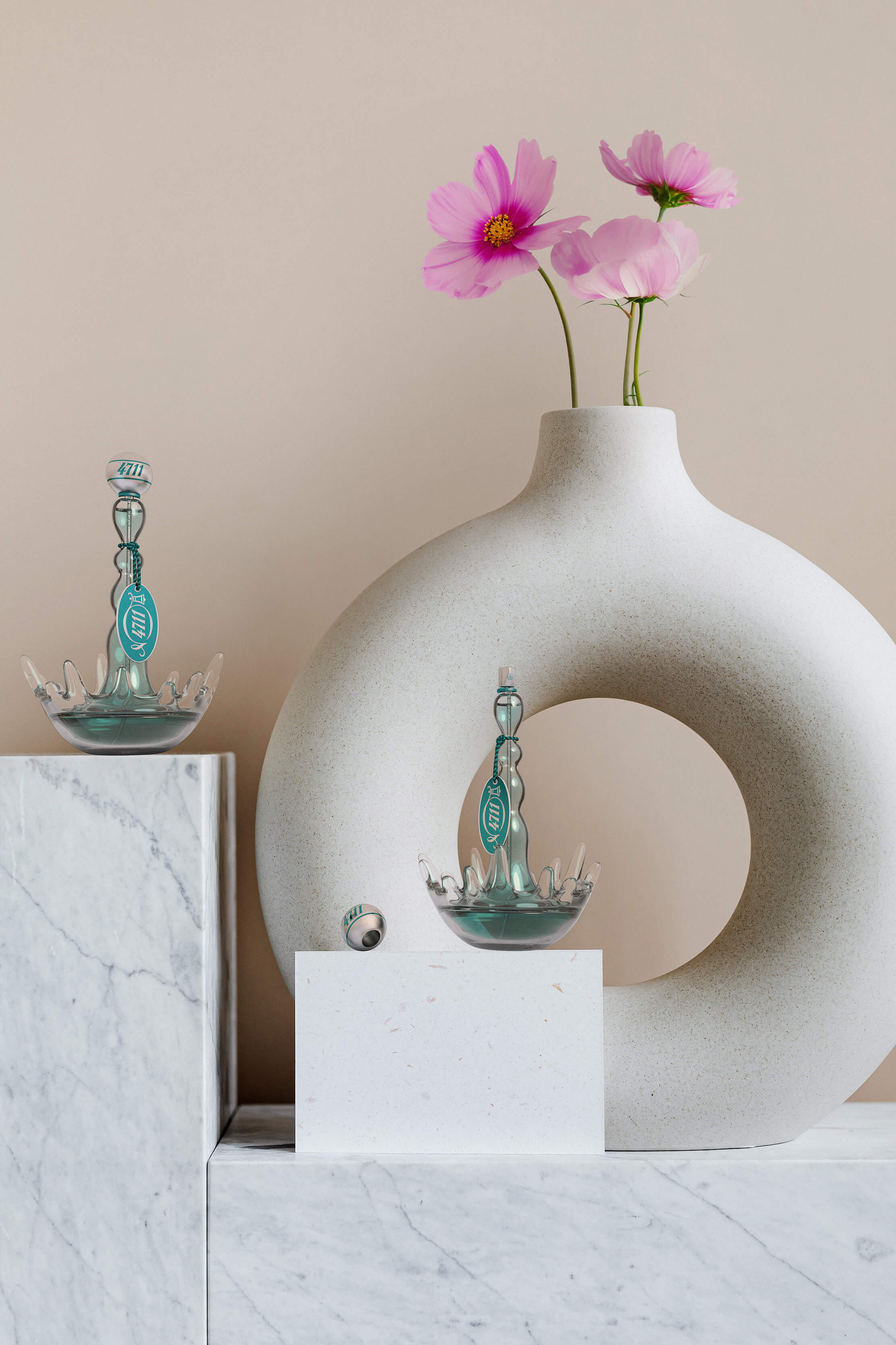
This concept design called Splash, was developed within the 4711 Design Competition in 2011. The main purpose of this concept was to convey the fragrance sensations through the shape and the materials used in this premium bottle. Water is a recurring element in perfumes' communication but rarely it’s applied to the packaging itself. Therefore this was the start up to this project.
Concept and Inspiration
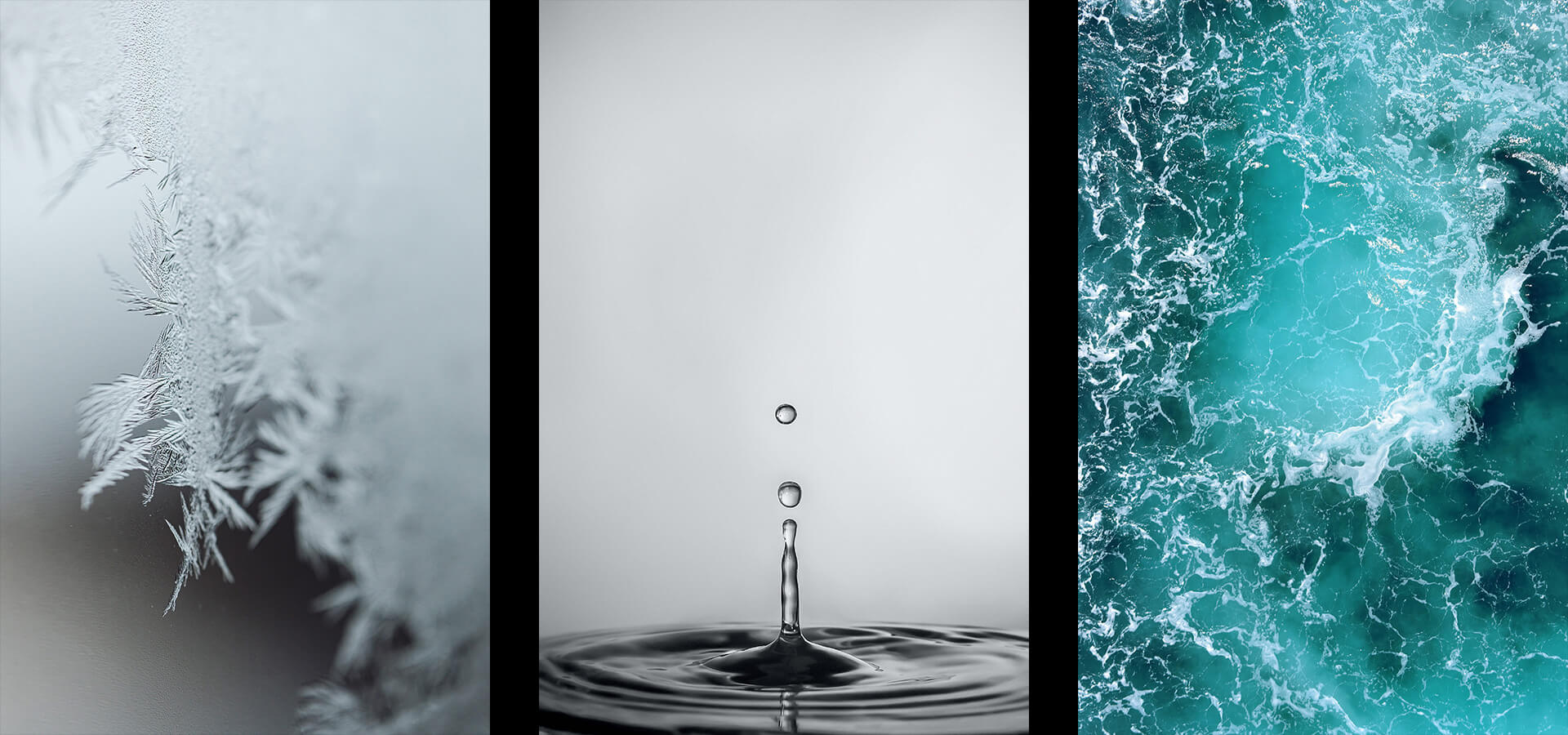
Associating the bottle’s shape with the colour of the fragrance made it possible to convey the sensation of freshness and weightlessness.
Associating the bottle’s shape with the colour of the fragrance made it possible to convey the sensation of freshness and weightlessness.
Associating the bottle’s shape with the colour of the fragrance made it possible to convey the sensation of freshness and weightlessness.
Associating the bottle’s shape with the colour of the fragrance made it possible to convey the sensation of freshness and weightlessness.
Associating the bottle’s shape with the colour of the fragrance made it possible to convey the sensation of freshness and weightlessness.
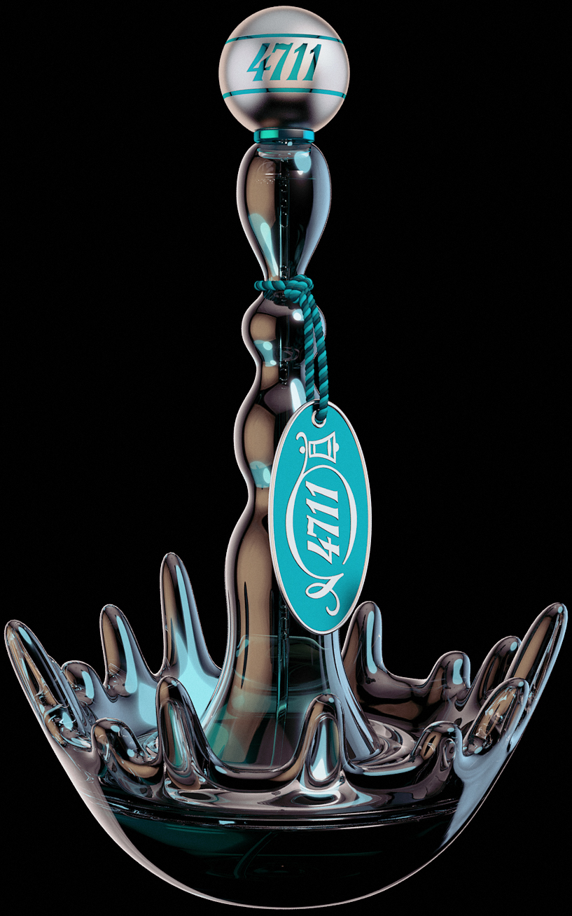
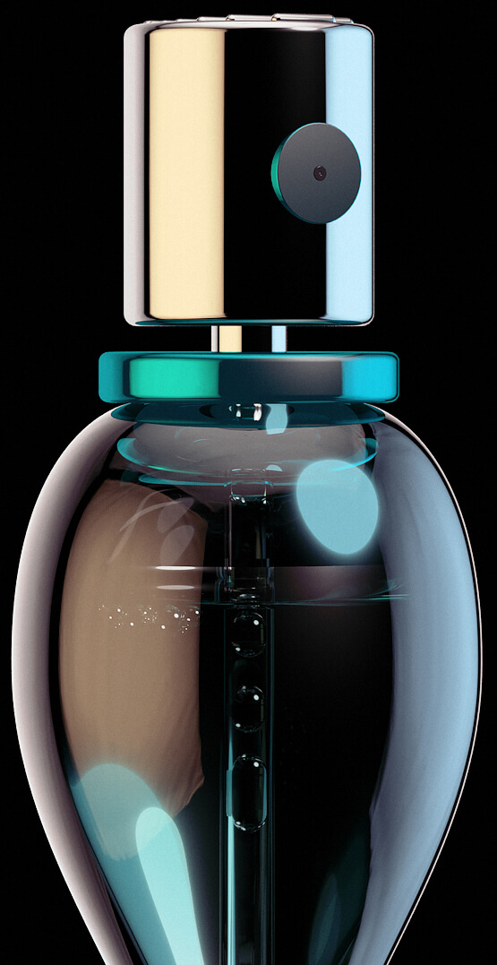
The idea emerged of a bottle shaped as a splash of water made of crystal, where the metal lid symbolizes the water droplet to emphasize the splash.
The idea emerged of a bottle shaped as a splash of water made of crystal, where the metal lid symbolizes the water droplet to emphasize the splash.
The idea emerged of a bottle shaped as a splash of water made of crystal, where the metal lid symbolizes the water droplet to emphasize the splash.
The idea emerged of a bottle shaped as a splash of water made of crystal, where the metal lid symbolizes the water droplet to emphasize the splash.
The idea emerged of a bottle shaped as a splash of water made of crystal, where the metal lid symbolizes the water droplet to emphasize the splash.
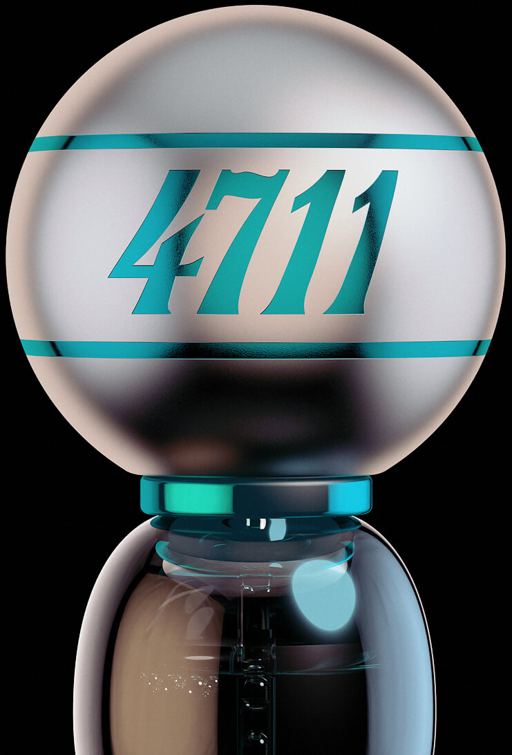
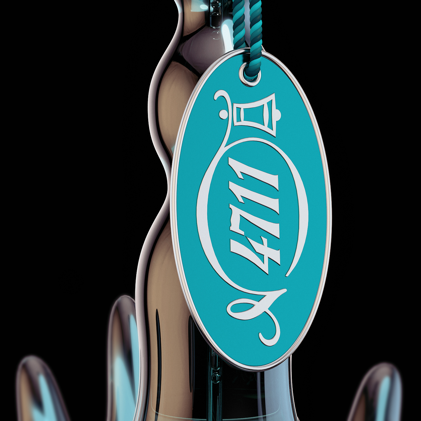
All details were seriously thinked and there is one purpose for each one. This brand plate is the final touch to this package. The main reason for it is of course brand placement but the consumer can use it as a prop like a keychain for example.
All details were seriously thinked and there is one purpose for each one. This brand plate is the final touch to this package. The main reason for it is of course brand placement but the consumer can use it as a prop like a keychain for example.
All details were seriously thinked and there is one purpose for each one. This brand plate is the final touch to this package. The main reason for it is of course brand placement but the consumer can use it as a prop like a keychain for example.
All details were seriously thinked and there is one purpose for each one. This brand plate is the final touch to this package. The main reason for it is of course brand placement but the consumer can use it as a prop like a keychain for example.
All details were seriously thinked and there is one purpose for each one. This brand plate is the final touch to this package. The main reason for it is of course brand placement but the consumer can use it as a prop like a keychain for example.
The chosen materials and colors were decided to precisely match the brand communication but also to convey the idea of freshness of the sea.
The chosen materials and colors were decided to precisely match the brand communication but also to convey the idea of freshness of the sea.
The chosen materials and colors were decided to precisely match the brand communication but also to convey the idea of freshness of the sea.
The chosen materials and colors were decided to precisely match the brand communication but also to convey the idea of freshness of the sea.
The chosen materials and colors were decided to precisely match the brand communication but also to convey the idea of freshness of the sea.
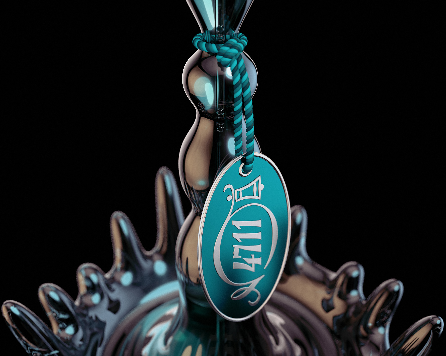
The bottom shape of this splash was designed to provide stability to the bottle beyond what has been stated. Due to its proportion, there was a need to create a larger bottom.
The bottom shape of this splash was designed to provide stability to the bottle beyond what has been stated. Due to its proportion, there was a need to create a larger bottom.
The bottom shape of this splash was designed to provide stability to the bottle beyond what has been stated. Due to its proportion, there was a need to create a larger bottom.
The bottom shape of this splash was designed to provide stability to the bottle beyond what has been stated. Due to its proportion, there was a need to create a larger bottom.
The bottom shape of this splash was designed to provide stability to the bottle beyond what has been stated. Due to its proportion, there was a need to create a larger bottom.
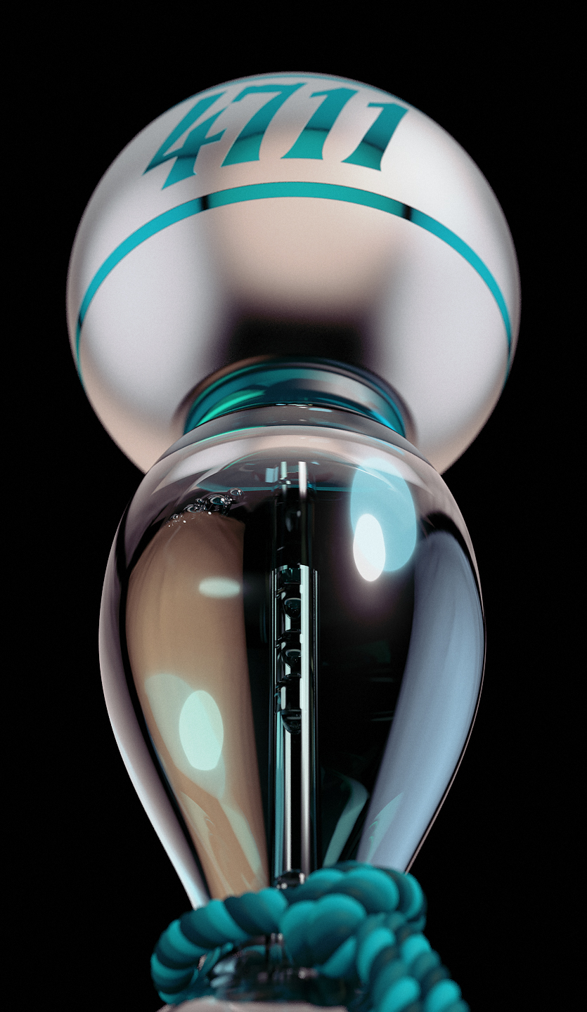
The proportion of this perfume bottle was purposely designed to confer magistracy sensation like a Golden Globe for example.
The proportion of this perfume bottle was purposely designed to confer magistracy sensation like a Golden Globe for example.
The proportion of this perfume bottle was purposely designed to confer magistracy sensation like a Golden Globe for example.
The proportion of this perfume bottle was purposely designed to confer magistracy sensation like a Golden Globe for example.
The proportion of this perfume bottle was purposely designed to confer magistracy sensation like a Golden Globe for example.
More
Work
More
Copyright © 2025 João Mendes | All rights reserved
Copyright © 2021 João Mendes | All rights reserved
Copyright © 2021 João Mendes | All rights reserved